
Here at the Global Water Security Center, we translate science for policy makers. If you’ve had a look at any of our briefing materials lately, you know that one part of what we do is data analysis.
Did your eyes just glaze over at the mention of data analysis? Are you feeling that familiar sense of math anxiety rise in your belly? Please don’t leave just yet!
In this blog post, we (Kaitlin and Erin) are going to give you an easy-to-understand overview of what we do when we get assigned a new briefing. We hope you will leave with a better understanding of the process of environmental data analysis and how we make the figures and charts that you see in GWSC’s products.
Meet the Data Scientists
Before we go any further, we’d like to introduce ourselves. The data analysis that happens at GWSC is performed by the team of Environmental Data Scientists. Dr. Kaitlin Kimmel-Hass and Dr. Erin Menzies Pluer are the primary contributors to data analysis for the products and briefing materials that we generate.
Kaitlin is an ecologist whose past research has included topics like biodiversity loss, adaptive management, meta-science, and causal inference. Her most recent publication shows that many of the empirical results reported in ecological studies are likely exaggerated.
Erin is an environmental engineer and hydrologist whose past research has focused on agricultural best management practices, water resources management, and nutrient cycling. She came to GWSC from a AAAS Science and Technology Fellowship in the federal government supporting food security programming at USAID.
As data scientists, Kaitlin and Erin, are involved to some degree on all of our products. Some of our projects are more data-intensive and others are less so. Whether a product is data-heavy or data-light depends on a number of factors including the context, the client’s request, and availability of data. Some of our more data intensive projects include an overview of climate change impacts in the Middle East, an assessment of current drought and it’s impacts on the function of the Panama Canal, and an environmental security overview of Slovenia.
While it takes a whole team of folks to create our products, we want to provide a glimpse into how the Data Scientist team tackles assignments – from the tools of the trade, through standard analyses and into more data-intensive bespoke analyses.
Tools of the Trade
We use a number of analytical tools to process and explore the wide array of relevant datasets. We use Databricks, a cloud-based computing platform, and R, a programming language for data analysis and visualization, to process data, conduct analyses, and visualize trends.
The most common datasets we pull from are the ECMWF Reanalysis v5 (ERA5), the North American Multi-Model Ensemble (NMME), and the Coupled Model Intercomparison Project Phase 6 (CMIP6). ERA5 provides us with historical daily precipitation and temperature values. The dataset contains many more variables but we mostly use precipitation and temperature.
The NMME data are a short-range prediction of precipitation in the next few months. Lastly, the CMIP6 data are long-range climate change predictions, again we mostly stick to the temperature and precipitation data. In addition to these three, other datasets we might pull from include rain gauge data, streamflow data, land use/landcover data, population data, or many more depending on the brief.
Understanding the Current Climate Context
One of the most important things we do when creating a briefing is to situate the current (or future) weather conditions into their historical context.
Typically, when a request for information comes in, the first step we take is to look at the historical temperature and precipitation data for the region of interest. Headlines screaming about drought in Panama? We check the historical record to see what precipitation patterns have looked like in the past. Concerns about extreme heat in the Middle East? We check the historical record to see what temperatures have looked like in the past.
There are a few standard analyses that we (almost) always conduct when getting started on a new brief. These don’t usually make it into the finished product, but they help the whole team understand the system in which we are working and build context for deeper questions and analyses.
Because there are many dimensions to our data (meaning it spans both time and space), we use a different graphics, like maps, bar graphs, boxplots, and scatterplots, to visualize the data. Here are a few examples of those standard analyses and what the graphical output may look like:
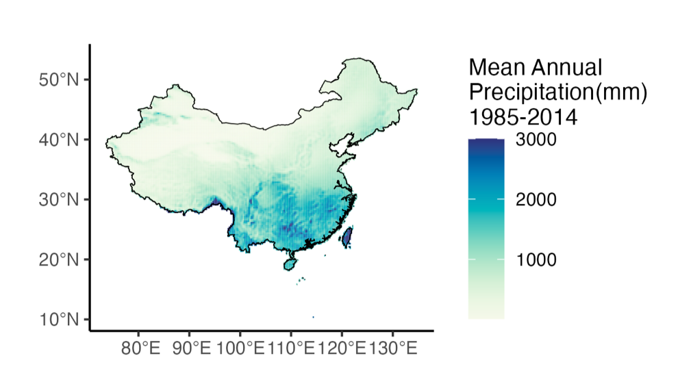
- To understand the typical precipitation over space in a region, we calculate the mean annual precipitation over a 20 – 50-year time period. This is also sometimes referred to as the ‘normal’ for precipitation or, in our climate change briefs, as the reference period precipitation. We commonly visualize mean annual precipitation with a map. Here we show the normal precipitation (mean annual precipitation) for China between 1985 and 2014. Darker blue areas get more precipitation on average whereas lighter yellow areas get less on average. These maps help us scope a region and to understand its current climate. From this map we can see the spatial distribution of precipitation and better understand where changes in future precipitation may hurt the most. If the deserts in the northwest get drier, it probably won’t affect status quo much. However, we want to be aware of precipitation changes in the eastern part of China where much of their agriculture and most of the people live.
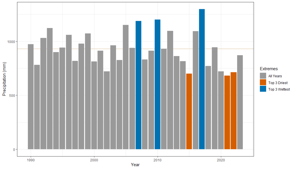
- To understand typical precipitation over time, we calculate the total annual precipitation for each year in the historical record. This reveals trends about very wet or very dry years and give us a sense of the range of annual precipitation values that can be reasonably expected. Below you can see total annual precipitation in the Massacre River Watershed, which spans the border between Haiti and the Dominican Republic. The data are visualized in a bar plot with wet and dry years highlighted and the mean annual precipitation noted with a horizontal line. From this plot we can see that this watershed has had below average precipitation for the last few years and two of the 3 driest years have happened since 2020. This tells us that the people who rely on the river water might be noticing that there’s less water to go around.
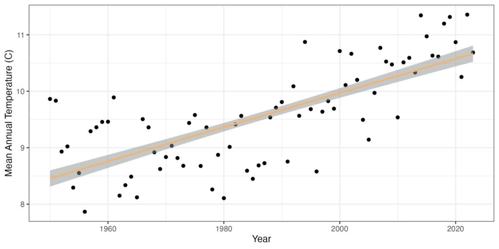
- To understand trends in temperature over time, we calculate mean annual temperature for each year in the record and use display the data as a scatter plot with time on the x-axis. This can give us a sense of the amount of warming over time in a given location. This analysis often makes it into the briefing materials as one sentence or a supplemental figure: “Slovenia’s temperatures have increased an average of 2ºC since 1950.” Below the temperature data are displayed for Slovenia between 1950 and 2023 with a best fit line of the statistical model output.
Going Beyond the Basics
After we have built out the context and looked at simple trends, we often need to work with the data in more tailored ways. These analyses may address a specific question asked by the partner or provide further insight into something we saw in the standard analyses. A few examples of tailored analyses that made it into recent briefs are:
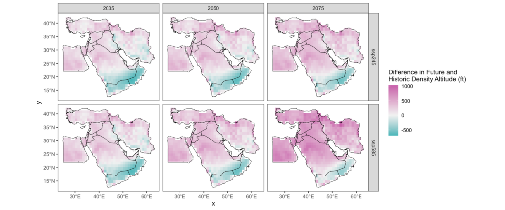
- When working on a climate brief, we discovered that temperatures were going to drastically increase in most of the Middle East. Temperature is an important factor in determining how heavy airplanes can be to safely fly. Our story wrangler wanted to understand how the projected increase in temperature would impact density altitude – an indicator of airplane performance. Here, we combined data from global climate projections in the years 2035, 2050, and 2075, altitude maps, and an equation that approximates density altitude based on standard pressure (a constant), altimeter setting (an adjustment to standard pressure pilots make at airports), elevation, temperature, and temperature adjusted for elevation. We made some assumptions with our altimeter setting values based on regional airports. The below maps show how density altitude will change over the three future periods and for two different climate change scenarios. Darker pink areas indicate an increase in density altitude on average where the darker blue regions indicate a decrease in density altitude on average. The maps show that density altitude is going to increase for most of the region – meaning that airplanes may have to be lighter to fly similar paths as today.
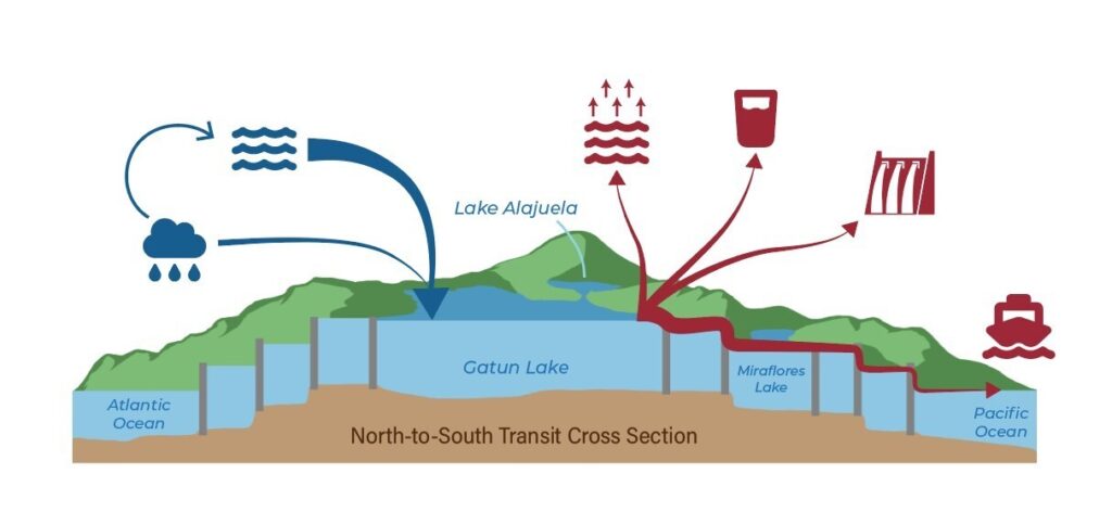
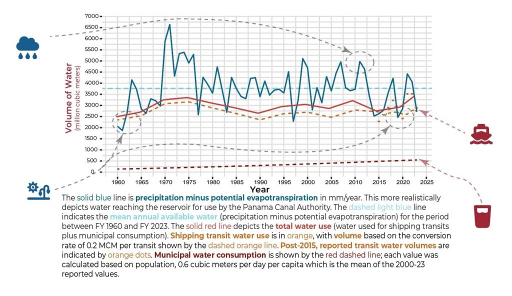
- After some attention-grabbing headlines about drought impacting operations at the Panama Canal, we had a look at drought conditions in the region. We discovered that while it has been pretty dry, precipitation in recent years has been within the historical range of normal. But more importantly, we found the Panama Canal Reservoir is a very tightly managed system with every drop possible allocated to moving ships. So, when it is drier than average, they feel the pinch. To illustrate the tight margins Canal operators are working with, we did a mass balance on the reservoir. We calculated PET in the watershed and subtracted it from precipitation. Then we used a line graph to plot all of the water uses and the available water; when the lines cross, the Panama Canal Authority is under stress.
Ongoing Work of a Data Scientist
While we have standardized analyses, we continually are innovating and learning in our role. As with all scientific inquiry, when we complete a briefing, we are always thinking about what topics we want to learn more about and generating questions for further inquiry to improve future products.
When we are not actively working on a brief, we take time to explore some of the data-focused questions we have generated. Some of the questions that we are currently excited about include: How do we navigate model variability in both the sub-seasonal forecasts and longer-range climate forecasts? How do we balance simplicity and accuracy when calculating PET? What is the best way to communicate uncertainty or variability with our particular audience?
Keep your eyes peeled for more blog posts as we investigate these questions and others relevant to water and climate security communication with policy makers.